
Project Manager at Context



About The Client
Context is a modern collaboration platform that enables high-performance teams to organize plans, capture ideas, and work seamlessly in one shared workspace.
Context's rapid user growth left their product experience fragmented. They were struggling with layout clutter, inconsistent UI elements, and a lack of a unified design language. This disjointed UX increased navigation complexity for users and slowed down internal product delivery.
Their team needed a centralized visual foundation to ensure absolute design consistency, simplify feature additions, and elevate their visual identity to match their premium positioning.
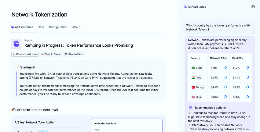
We redesigned Context's entire digital layout from the ground up, implementing a robust 12-column grid system and an optimized dark-mode theme. We resolved visual friction by designing a clean component library in Figma, ensuring pixel-perfect unity across all product screens.
By establishing structured layouts, clean type styling, and visual hierarchies, we transformed a complex productivity board into an intuitive, high-performance interface.

User Engagement

Faster Shipping

Figma Components
To elevate Context's product experience, our design approach focused on three critical pillars:
• Visual Hierarchy & Layout: We eliminated clutter by prioritizing primary actions, setting clear typographic hierarchies, and structuring layout widths to improve readability and task-completion speeds.
• Figma Design System Orchestration: We created a complete libraries system with tokenized color, radius, and type variables, allowing the Context product team to scale features efficiently while staying 100% consistent.
• Delightful Interactions: We developed micro-interactions and transitions for active button states, hover animations, and load cycles, creating a tactile and extremely premium application feel.
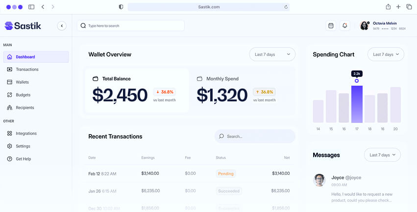
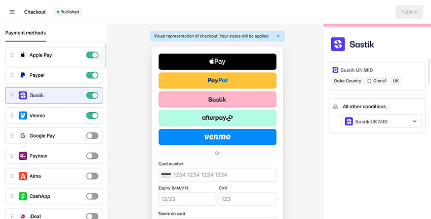
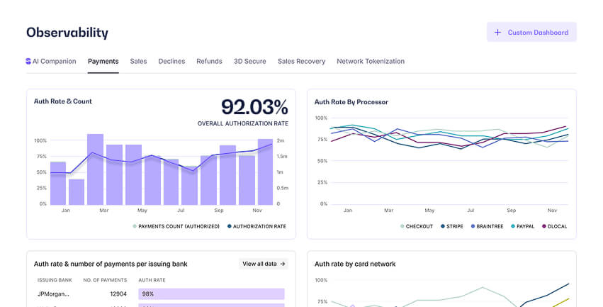
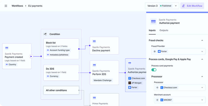
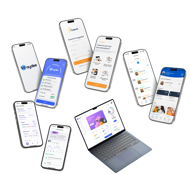
Explore the different views, system layouts, and interactive screens designed for Context.